Visual Identity Design Services
A logo is one asset. A visual identity is the system that makes everything look like you.
Start a projectYour brand looks like five different companies made it. The deck doesn’t match the website, the website doesn’t match the ads, and every new hire who opens Figma reaches for a slightly different blue. That’s not a logo problem. It’s the absence of a visual identity — a system that makes every decision once, so nobody has to improvise.
A visual identity is the designed system behind your brand: the logo and its variants, color with defined roles, typography that scales, iconography, and the rules that hold it together. We build it specifically for the surfaces you ship — site, social, decks, packaging, email — and pressure-test it where it has to work, because identities that only live in a case study fall apart in production. You get a real asset library: organized files, clear naming, guidelines short enough that people actually read them.
Most studios design a beautiful system and hand you a PDF. Then it drifts — because consistency isn’t a deliverable, it’s a practice. Metrix Digital builds the identity and can run it: keeping the guidelines current, producing on-brand assets as you grow, and catching drift before it spreads. People make the design calls and own the judgment; our systems give them the cadence to keep it consistent at scale. That’s the difference between owning a logo and owning a brand.
Built and run, end to end.
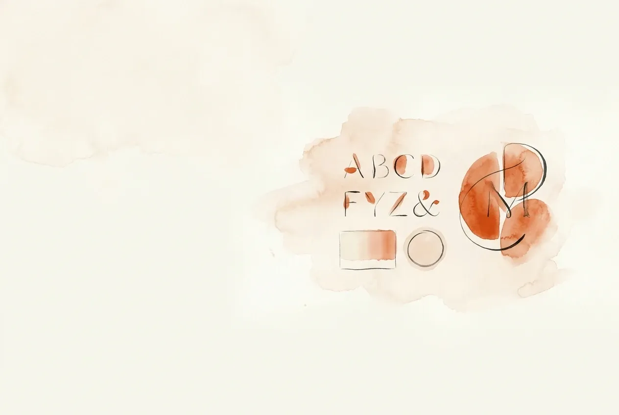
Core mark and logo system
Primary logo, secondary lockups, monogram, and an app-icon-safe version. We design the variants you'll actually need — horizontal, stacked, single-color, knockout — and define the clear space and minimum sizes so the mark holds up at 16px and on a billboard. One mark is a logo. The full set is a system you can use without guessing.
Color system, not a palette
Primary, secondary, and functional colors with defined roles — what carries the brand, what's for backgrounds, what signals success or error in product UI. Every value specified in HEX, RGB, and CMYK, with accessible text pairings checked against WCAG contrast ratios. A palette is six swatches. A color system tells you which one to use where.
Typography that scales
A type system with a display face, a workhorse text face, and a type scale that holds from a hero headline to a 12px legal line. We pick typefaces you can license and load — web font weights, fallback stacks, and real licensing costs surfaced up front, not a $4,000/year foundry surprise after launch.
Asset library, production-ready
Logo files in SVG, PNG, EPS, and PDF; color and type tokens; iconography and any supporting graphic elements. Organized, named clearly, and delivered in a structure your designers, developers, and vendors can pull from without a single 'do you have this in white?' email.
Brand guidelines that get used
A usage guide that shows the right way and the wrong way — spacing, color application, type rules, what not to do to the logo. Short enough that people read it, specific enough to settle an argument. Built as a living document we keep current as the brand grows, not a 90-page PDF that dies in a shared drive.
Application across real touchpoints
We design the system against the surfaces you actually ship — website, social, pitch decks, packaging, email, ads. Designing in the abstract is how identities look great in a case study and fall apart in production. We pressure-test the system where it has to work before we call it done.
Questions, answered.
What's the difference between a logo and a visual identity?
A logo is one asset — the mark. A visual identity is the full system around it: logo variants, color with defined roles, typography, iconography, layout rules, and the guidelines that tell people how to use all of it. A logo alone leaves every other decision — what blue, which font, how much space — up for grabs, which is how brands drift. The system is what keeps everything looking like you across channels and across the people making it.
Do I need a full visual identity, or just a logo refresh?
Honest answer: it depends on where the inconsistency is coming from. If your logo is the only problem, a refresh is the right scope and we'll tell you that. But most 'our brand looks off' problems aren't the logo — they're the absence of a system, so every designer, deck, and vendor improvises. If your materials look like five different companies made them, you need the system, not a new mark.
How long does a visual identity project take?
For a mid-market brand, typically six to ten weeks from kickoff to a delivered system, depending on scope and how many stakeholders weigh in on decisions. The logo and core elements come together faster; the time goes into building out the full system, testing it against real applications, and writing guidelines that hold up. We scope the timeline against your launch date, not a generic template.
What files and deliverables do I actually get?
Logo files in vector (SVG, EPS, PDF) and raster (PNG) formats, including single-color and knockout versions. Color values in HEX, RGB, and CMYK. Type specifications and the scale. Iconography and supporting graphic elements. A usage guide. And design tokens where your build needs them. Everything organized and named so your team and your vendors can use it without coming back to ask.
Do you handle the fonts and licensing, or is that on us?
We surface licensing up front. When we recommend typefaces, we tell you the real cost — web font subscription, desktop license, app embedding — before it's locked in, so there's no foundry invoice surprise after launch. Where it makes sense, we'll steer toward high-quality faces with sane licensing or open-source options. The decision is yours; we make sure it's an informed one.
What happens after the identity is delivered — do you keep it consistent?
This is where we're different from most identity studios. We don't hand over a file package and disappear. We build the system, and we can run it — keeping the guidelines current, producing on-brand assets as you need them, and catching drift before it spreads. An identity is only as good as how consistently it's used six months in. We stay for that part.